The Altar - Kitchen interior design tips, from an architect's perspective
16 June 2021 by Simon Drayson
Old browser alert! We have detected you are using a pretty old browser. This website uses cool features that can't be supported by your browser.
If we let you see the website it would look all weird and broken, nobody wants that!
Update your browser!16 June 2021 by Simon Drayson
For many of us, this past year has been as much about looking backwards as it has about looking forward. During lockdown we both took the opportunity to revisit our decade-old academic work in order to help define our mission. For me this including rereading my thesis Sameness, which set out to identify a common architecture of essentiality, by exploring my former two-up-two-down Victorian terraced house (bread and butter for architects up and down the country).
In this journal entry we will be giving you some handy tips on how to design your kitchen, showing you how these have been applied in our projects by listening to our clients needs and wants.
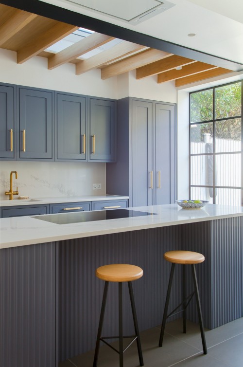
When it comes to the kitchen units themselves, a good place to start is to decide whether you want the doors to be regular or in-frame. In-frame kitchens are a popular choice – particularly in period properties, where conservation is important – but they do have their limitations: Regular doors are hinged off the front of the carcasses, meaning you get storage equivalent to the unit’s full width, minus the thickness of the carcass frame itself (so a 600mm-wide unit provides 564mm of storage). In contrast, in-frame doors are hinged off a frame that is in turn fixed to the front of the carcasses, meaning that the clear opening reduces by an inch or so on both sides. When designing a kitchen, it is generally best to work in multiples of 300mm, or 200mm with IKEA. Appliances aside, most units are available in either 300mm or 600mm depths; with wall and tall units being 700mm or 900mm and 2100mm or 2300mm respectively (check your ceiling height!). Alternatively you could opt for a bespoke kitchen, whereby everything is designed and made unique to fit your space perfectly, but this comes with a hefty price tag.
Appliances could be the subject of a blog in their own right, but the main choice is whether these should be freestanding (or ‘American-style’), integrated (fully hidden behind doors) or somewhere in between (‘semi-integrated’). It is worth sharing your preference with your architect from the outset as this can be used to inform other parts of the design. Whether you go for a gas or induction hob is down to personal preference, but we find that more and more clients are moving towards induction, given that utility providers are now offering electricity from 100% renewable sources. Either way, a cooker hood that extracts smoke and smells directly outside (as opposed to recirculating) is an absolute must. Whilst downdraught extractors are a great option for island units, the kit required to make these work will replace the otherwise desirable pan drawers. Ovens and fridge freezers can be located above or below waist height, depending on whether or not these need to be out of reach for children.
Worktops can make or break a kitchen design, and opinions on the best solution are plentiful. These range from timber and laminate at the least expensive end of the scale, to marble and granite at the opposite end, with solid surfaces such as Corian and quartz somewhere in the middle. As a general rule of thumb, the more expensive a worktop is, the more durable it will be. That said, timber worktops can bring warmth to a kitchen, with the patina of age only adding to their character. Your choice of worktop will large dictate the type of sink you will have: inset for timber and laminate; undermounted for marble and granite; or integrated for solid surfaces where worktop and sink are as one. When it comes to taps the possibilities are again endless, with some dispensing boiler, chilled and sparking water, although the kit required to make these work will take up most of the cupboard underneath.


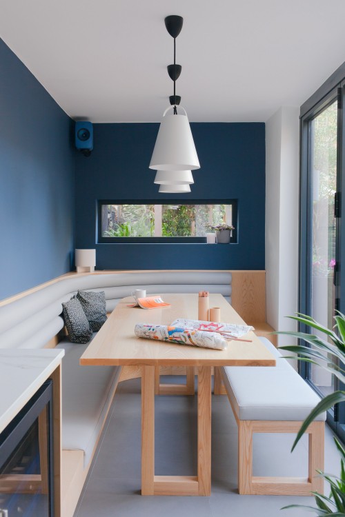
Whilst spotlights certainly create a good amount of light overall, then can create unwanted shadows on the worktop, if their layout is not considered carefully beforehand. These should always be combined with task lighting, often in the form of LED tape hidden under the wall units. Assuming there will some kind of island unit or table, you might also want to consider pendant lighting, which can create a more intimate atmosphere for dining. When choosing LED lamps for your kitchen lighting, be sure to check the Kelvin rating first; anything greater than 5,000k will be ‘cool white’ (more blue), with those lower than 3,000k being ‘warm white’ (more yellow). From our years of past experience, 2,700k is just right, but do try a sample first. Smart lights give you the option of changing these to suit any given situation, including being able to pre-define settings to suit your mood, dinner party or romantic dinner for two anyone? I’ve heard it said that you can never have too many power sockets in a kitchen, and whilst that may be true, it’s a good idea to think about what you need these for when planning your layout, to avoid trailing cables and splitters.


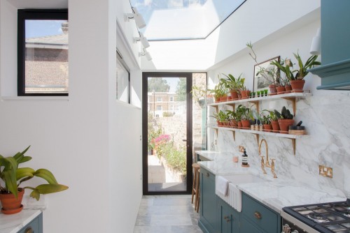
Whilst some manufacturers advertise paint as being suitable for kitchens, it is far better to avoid using paint in high contact areas, including the walls behind worktops and around hobs and sinks. Wall tiles or splashbacks (glass, stainless steel or worktop material) provide the perfect solution and a chance to add some visual interest. Whilst this will need to be fire resistant behind the hob for obvious reasons, lacquered timber can be used elsewhere to bring a greater sense of nature into the kitchen. And on that subject, be sure to design the space for your plants too, considering their daylighting needs. Whilst its undeniable that hard surfaces such as tiles are the most hardwearing and easy to clean in a kitchen, timber flooring – or timber-effect tiles or vinyl such as Karndean – can bring softness to these otherwise utilitarian spaces.

